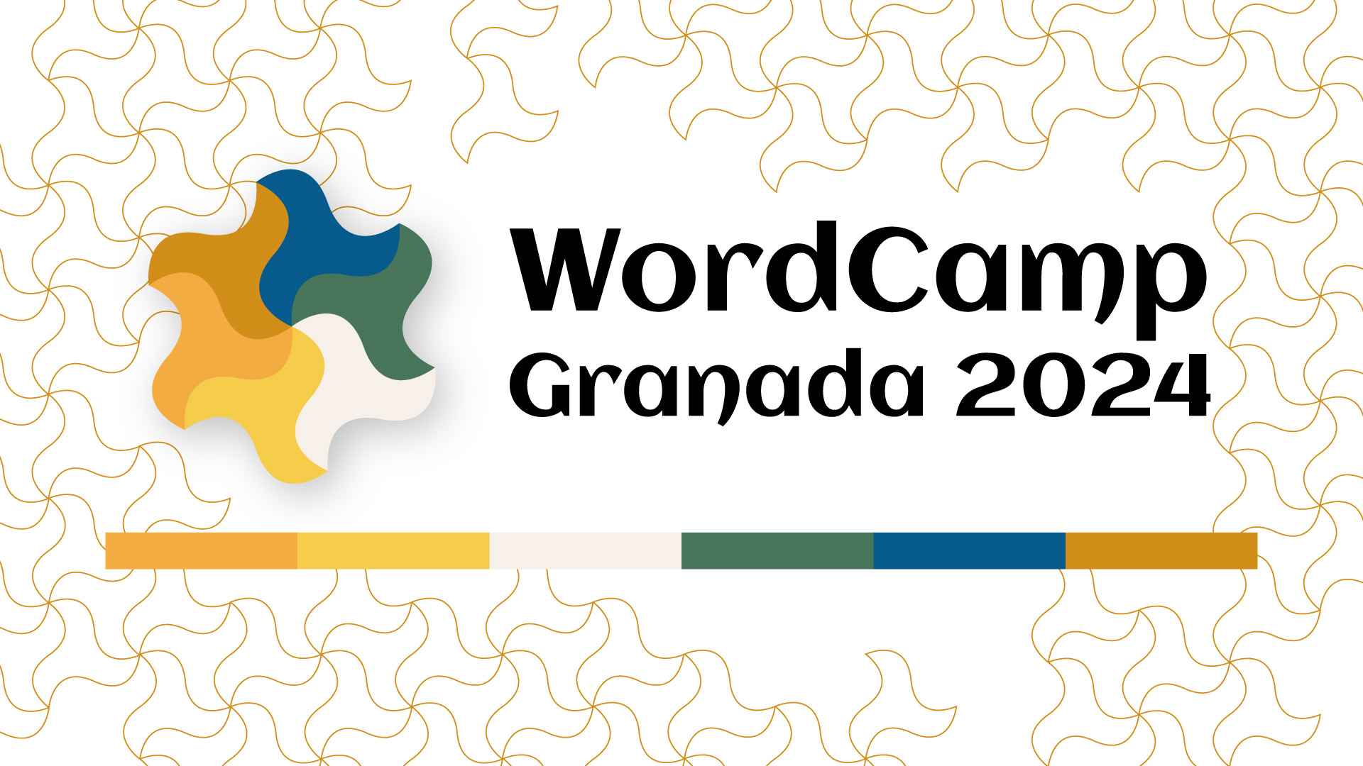
We were really excited about our branding this year. The 2024 logo was created by Ohia, who has been leading design and web efforts this year. Her goal was to capture the essence of Granada by blending the city’s natural landscape of the province with the intricate tile designs of the Alhambra. The result is a logo that highlights the beauty and history of this iconic Spanish city and surrounding region.
The earthy color palette chosen for the logo features three different shades of yellow and blue, along with green and a soft, dusty white:
- The yellows symbolize the warmth of the sun and the golden tones of the region’s desert plants and natural terrain.
- The blues echo the clear Andalusian skies.
- The green represents the lush foliage found in the Sierra Nevada mountains.
- The dusty white is a nod to the elegant, timeworn tiles and marble that adorn the Alhambra.

The shape of the logo draws inspiration from the geometric patterns of the Alhambra’s historic tiles, blending tradition with a modern touch. These tiles, known for their precision and symmetry, reflect Granada’s rich Moorish heritage, and the logo captures this sense of timeless beauty.
To celebrate the use of Google fonts in core with the release of WordPress 6.5, the Aclonica was chosen for the logo and site headings. Its resemblance to Andalucian calligraphy, brings a touch of local culture to the overall feel of the branding.
The #WCGR24 logo is a tribute to Granada’s unique charm, seamlessly merging its natural beauty with the artistic mastery of its history, people, and landmarks. Whether you’re visiting Granada just for WordCamp or you’re lucky enough to live here we want you to explore the Alhambra and see if you can the inspiration for this year’s designs.
The #WCGR24 team had a choice of 7 color palettes and voted to come to a consensus on the final version. Below are the alternative colors, which one is your favorite?


